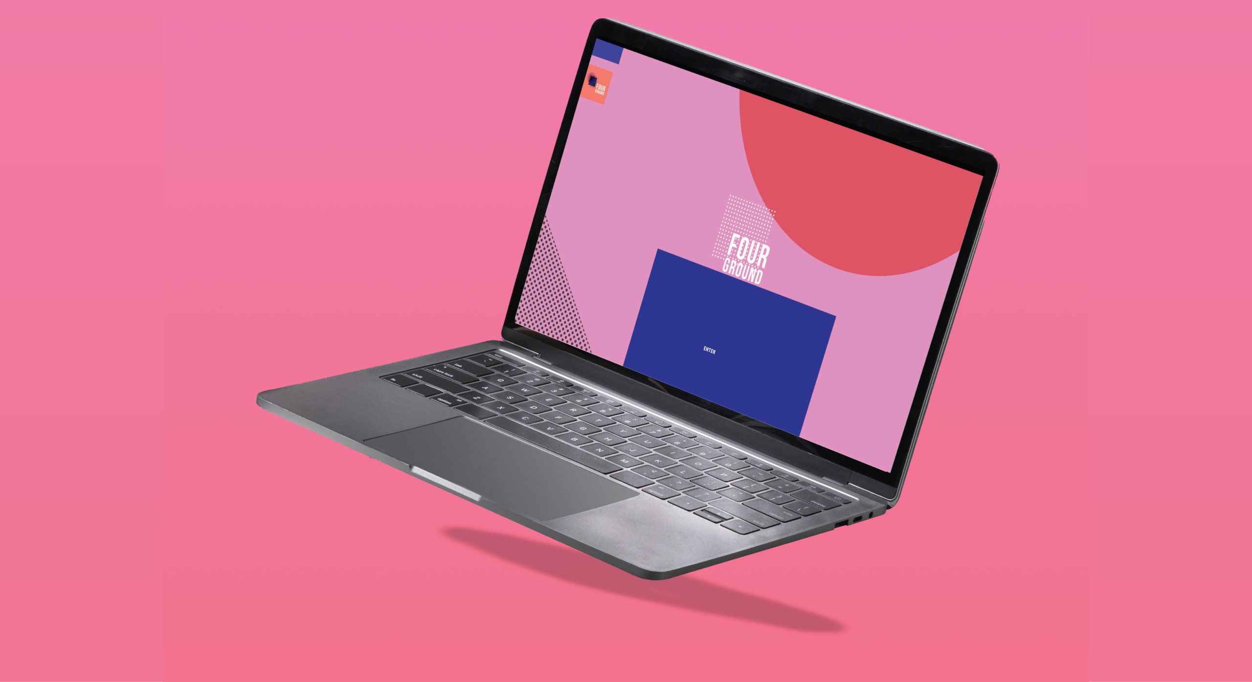
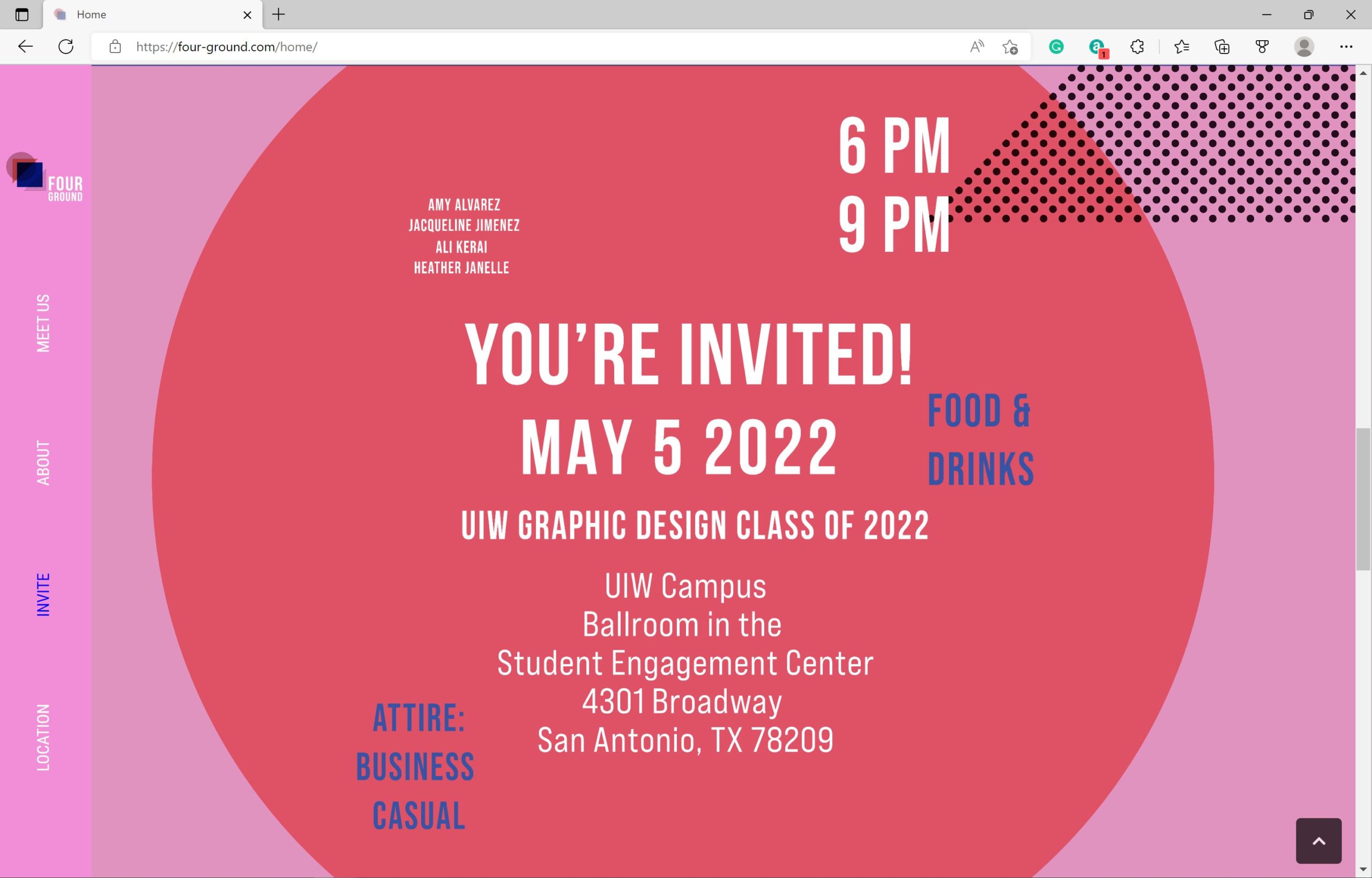
The senior show (Foreground) serves as a digital canvas/ marketing tool capturing the essence of the graduating class through visuals, narratives, and multimedia elements. Foreground inception to serve as a virtual portfolio launching the career of four graphic designers who required a front-end web design in hopes of pushing their designs to market and achieving exposure.
Phase ΙI
Define
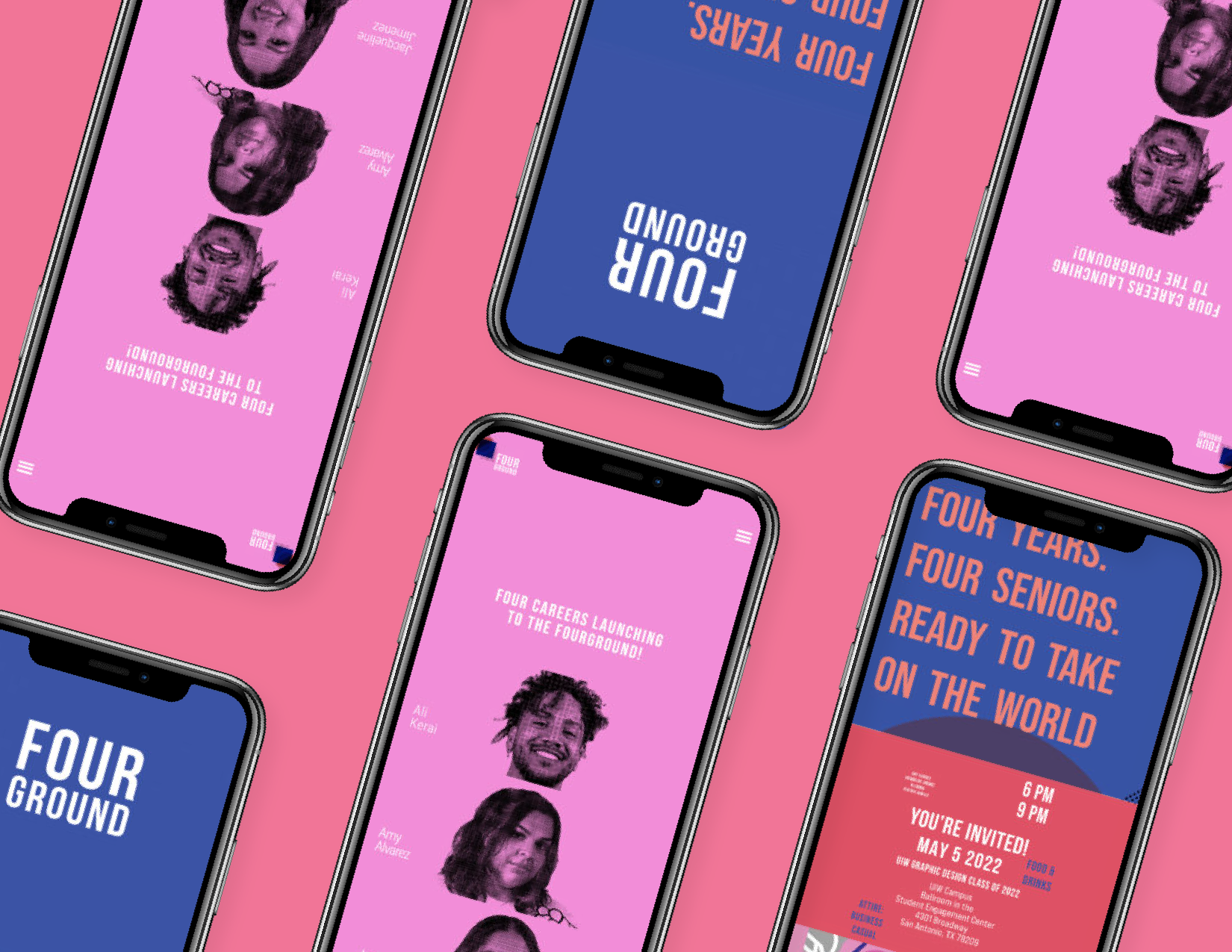
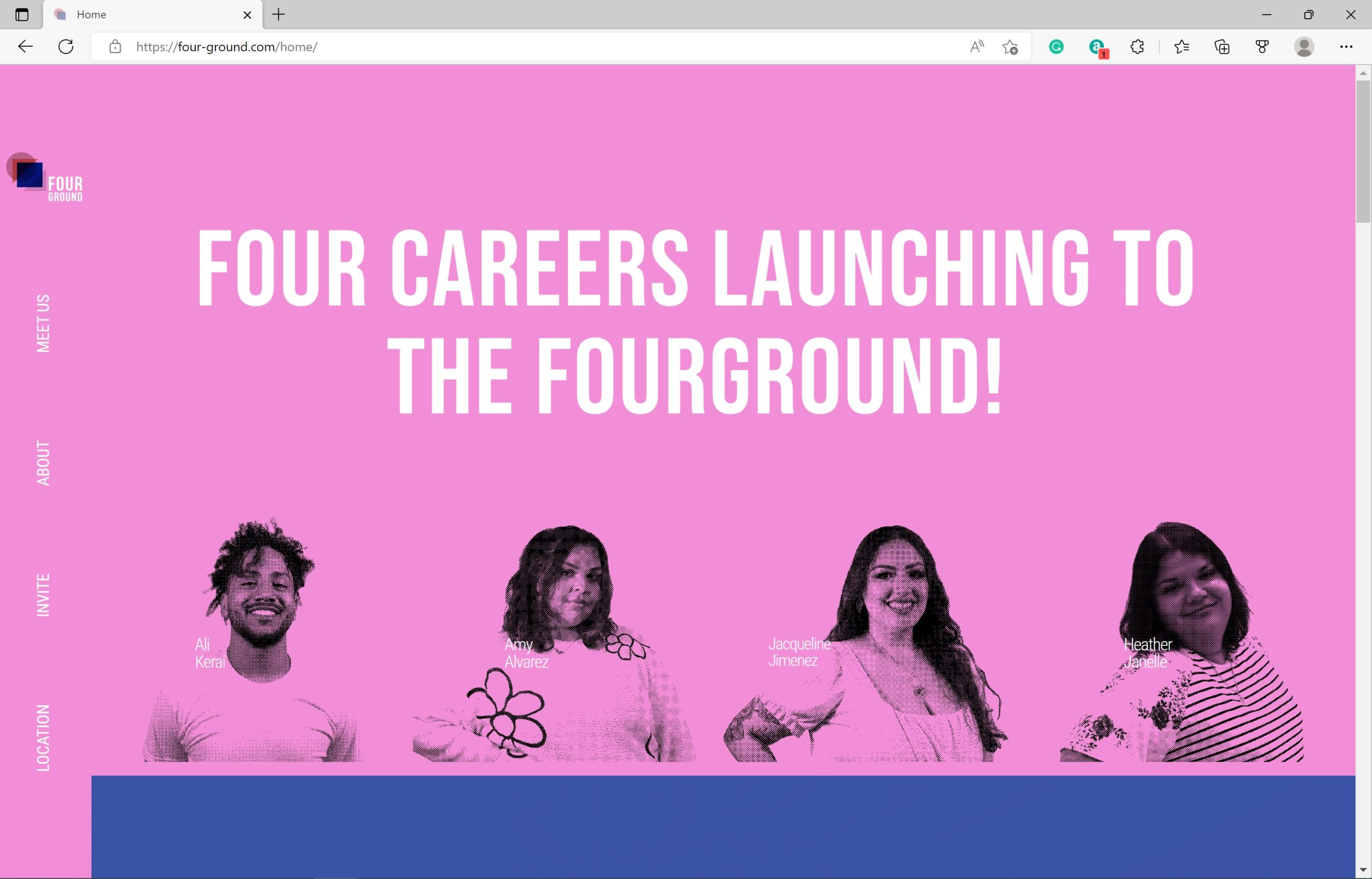
Trying a Horizontal menu
During the initial planning phase, I created a working wireframe outliningour early concepts for the website. One notable feature we wanted to incorporate is a horizontal website layout. This layout not only enhances the visual appeal of our site but also provides a distinct and engaging experience.
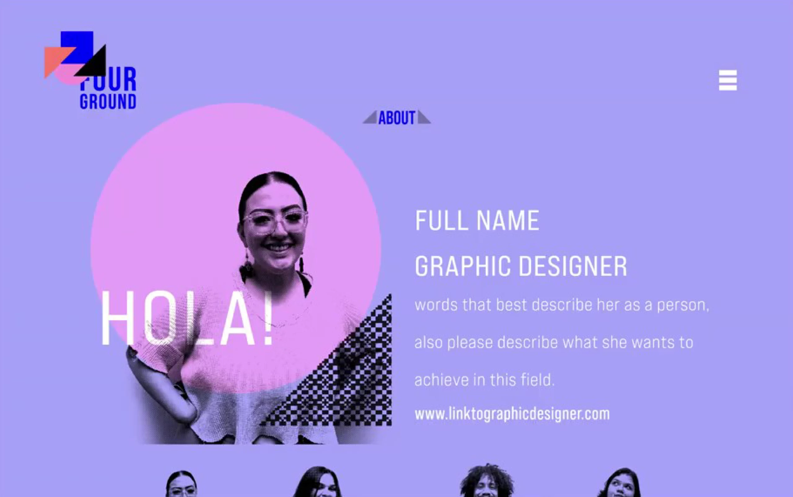
Emphasizing a dynamic logo system
We wanted to capture a dynamic logo system where I capitalizedshapes and structures in our logo throughout the entirety of the website. By leveraging these forms, we aim to create a memorable and visually appealing journey for visitors as they explore our site. We believe that by showcasing these qualities, we can attract the attention of potential clients and job prospects, establishing ourselves as leaders in our class.
Phase ΙII
Ideation / Prototype
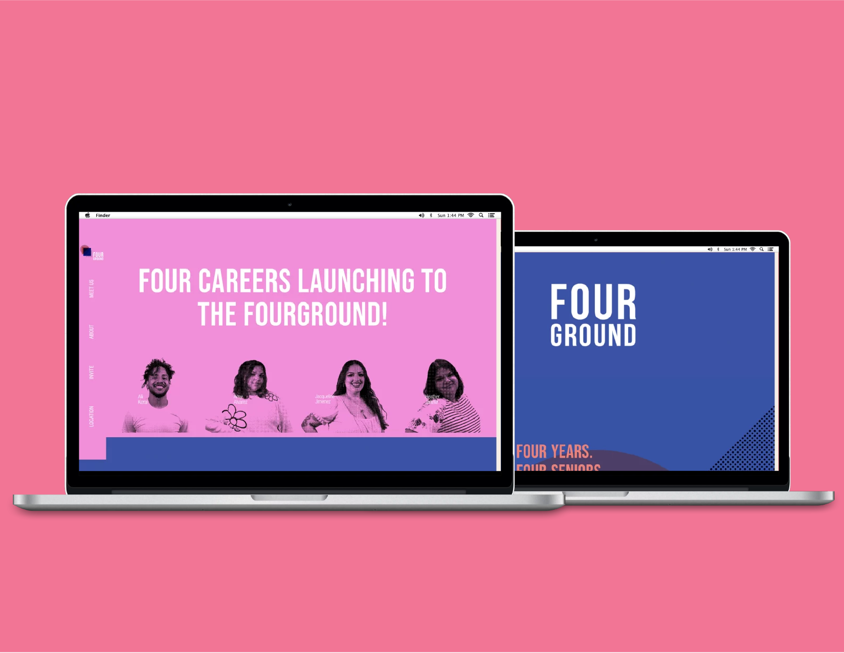
Prototyping and breaking down users’ reading pattern
In our development process, one of the key objectives was to enhance user navigation on our website. To achieve this, I decided to implement a horizontal navigation system, this approach offers several advantages for the users, particularly regarding the F-shaped scanning pattern commonly observed among users.
Horizontal Menu Prototype
Utilizing a horizontal navigation menu, I aimed to attract users and guide them seamlessly through our website. Research indicates users tend to scan web pages in a specific way: horizontally across the top, followed by a vertical scan down the left column. Taking this scanning pattern into consideration, I strategically organized our website’s layout to prominently feature three key sections: “Who we are,” “What we do,” and “Where to find us” correlating with the Layered cake theory.
Phase IV
Test
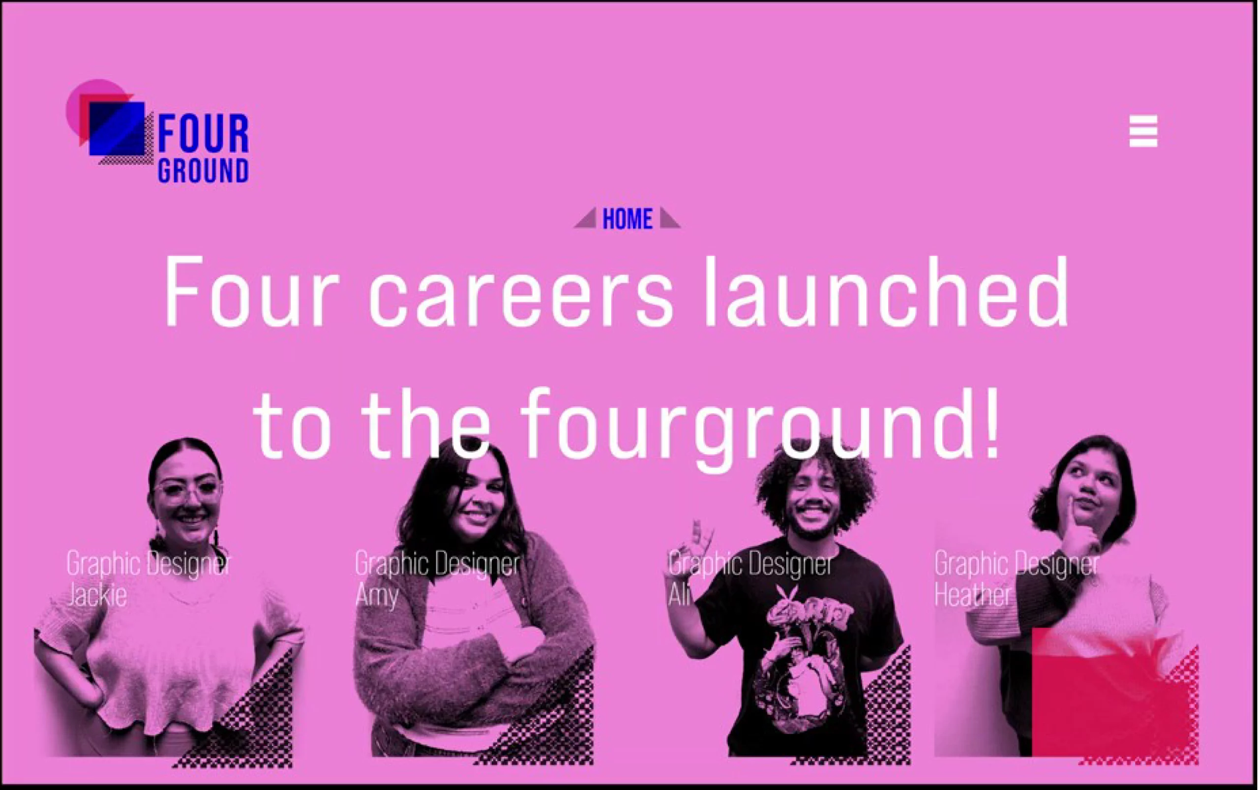
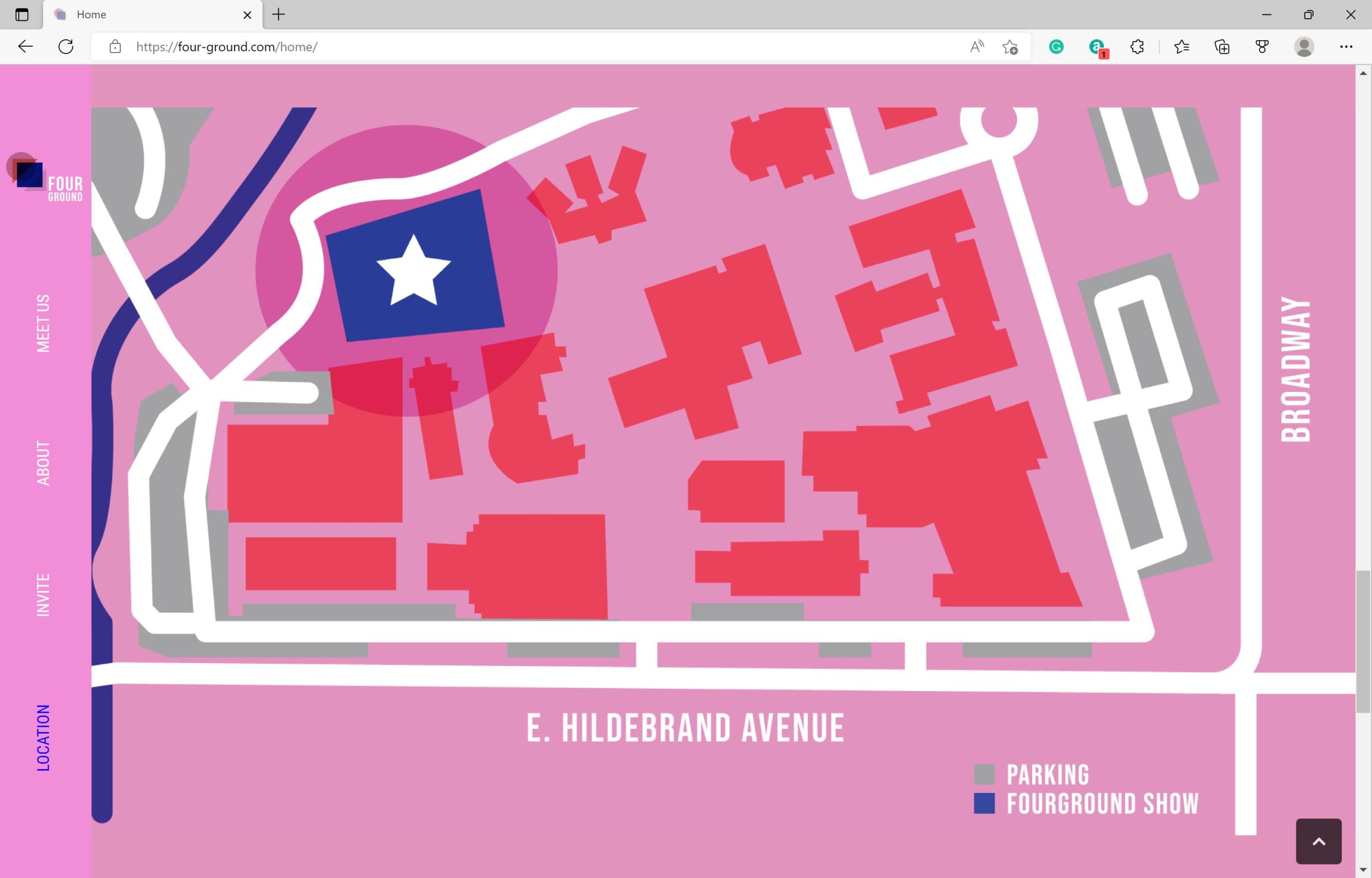
In the final quality assessment, testing revealed users preferred navigating the page through vertical scrolling utilizing the side navigation bar as a secondary tool. With increased website engagement, users realized the hover effect indicated the designer’s portrait served as links to their portfolios. Respective feedback expressed appreciation for the website as it provided a singular platform for diverse designers.
Phase V
Conclusion
Overall, the senior show turnout was prominent, giving seniors exposure to potential jobs. Key feedback from users was overtly positive with recommendations to prioritize the discoverability of the portfolio pages.